Date
September 16, 2026
Category
Reading Time
12 Best AI Startup Websites in 2026
Best AI startup websites, analysed: 12 examples with their trust signals, product demos and CTAs, plus the 5 patterns that make them convert.
Best AI startup websites, analysed: 12 examples with their trust signals, product demos and CTAs, plus the 5 patterns that make them convert.


The US alone funded 1,953 new AI companies in 2025, more than ten times the next closest country, according to Stanford HAI's 2026 AI Index. Visit thirty of their websites in a row and you'll struggle to tell most of them apart. Same gradient. Same abstract orb. Same headline promising an AI-powered platform for teams.
That sameness isn't laziness. It's what happens when a company can't yet describe its own product in plain words, so it borrows the visual language of the category instead. We've broken that down at length elsewhere. If you want to understand why the pattern repeats across almost every AI company, read our piece on why 90% of AI startups look the same.
Here, we're looking at the companies that got it right. A founder or marketing lead landing on your site is asking two questions in the first few seconds: what does this actually do, and should I believe it works? The 12 sites below answer both fast, and we reviewed each one the same way, looking at how it builds trust, how it explains something technical, and where it sends each buyer.
Much of this applies to any technical product, but the trust gap is sharper in AI because buyers are asked to believe a claim they can't verify by looking at it. If you're benchmarking outside AI, see our teardown of the best SaaS website designs.
A great AI startup website does three jobs fast. It explains what the AI actually does in plain words, proves the product is safe and real, and gives each type of buyer a clear next step. Sites that miss any of the three lose the visitor before the design gets a chance to work.
AI companies face a harder version of this test than most software. Edelman's latest Trust Barometer recorded a three-point global drop in trust in technology companies going into 2026, and its researchers note that trust in a system drives adoption while distrust holds development back.
The problem compounds for AI specifically. A visitor can't see the model, test the accuracy, or audit your data handling from a homepage, so they look for proxies instead.
Nielsen Norman Group sorts those proxies into four credibility factors: design quality, upfront disclosure, comprehensive and current content, and connection to the rest of the web. The strongest AI startup websites hit all four, and they do it without ever using the word trust.
Upfront disclosure is the one most AI startups skip. Pricing, data retention and who the product is for all belong on the page, not behind a sales call.
We started with a longlist of around 60 AI companies pulled from recent funding announcements, developer tool directories and design communities, then scored every site on the same five decisions.
Three rules shaped what made the cut. The company had to be a real AI business rather than a concept site or an agency portfolio piece. The site had to be judged on how it looks and works today, so a landmark redesign from 2023 that has since gone stale didn't qualify. And the list had to span stages, because a seed-stage vertical AI tool and a late-stage infrastructure platform are solving different problems and the lessons don't transfer cleanly between them.
We didn't build any of these sites. Nothing here is a portfolio piece, and no company on the list is a client.
The criteria come from our own work on websites for AI and technical products, where the same questions come up on every project. What does this do, why should I believe it, and what happens next.
The trust criterion in particular is adapted from the layered trust framework we use for fintech sites, where buyers face the same problem of being asked to believe a claim they can't verify from the page.
Two decisions shape how an AI website converts: who you tell the visitor it's for, and whether you let them see the price. Every site below was checked on both, on the same day, using the same definitions.
Read the columns vertically rather than row by row. What the category decided is more revealing than what any single company decided.
The twelve sites below sell wildly different things to wildly different people. A legal AI platform whose buyer is personally liable if it hallucinates. A voice API whose buyer will test the latency claim before reading the second sentence. An app builder whose buyer has never written a line of code.
They look nothing like each other, and that's the point. There is no house style here, no shared palette, no agreed way to do a hero. What they have in common is that each one decided who was arriving before deciding what to show them, and every choice on the page follows from that.
Each entry below is broken down the same way: what the company does, how the site builds trust, how it explains something technical, and what it asks the visitor to do next. Read them for the mechanics rather than the aesthetics, the transferable thing is rarely the design, it's the decision underneath it
Company Information
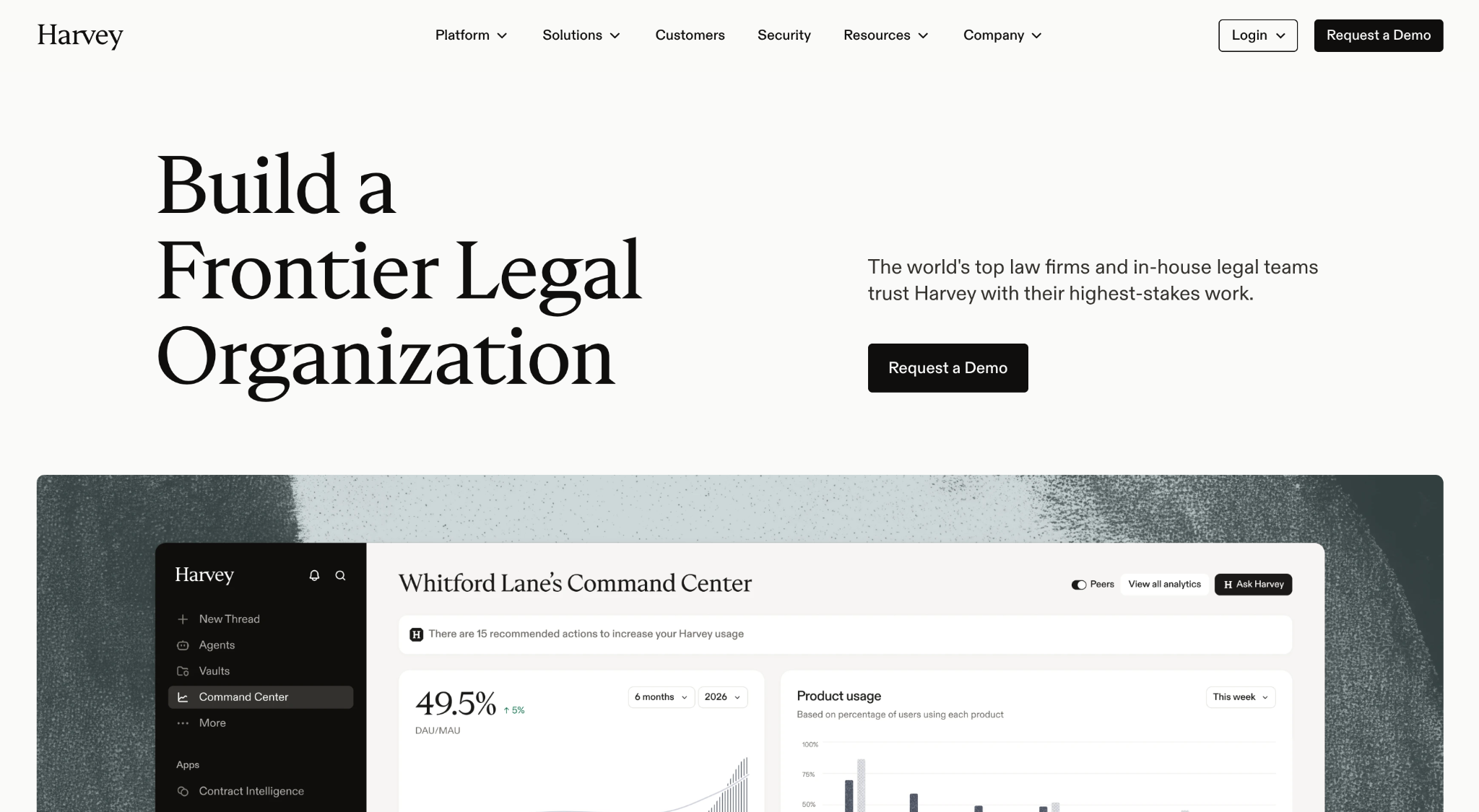
Why it works: Harvey has the hardest sell on this list. Lawyers are personally liable when AI gets it wrong, so trust has to be won before a single feature matters. It's here because it solves that with structure rather than reassurance. The outcome headline, "Build a Frontier Legal Organization", is backed by 2,400+ organisations and forty firm logos before you scroll, and six compliance badges sit on the homepage itself rather than in a legal subfolder. What it does best is treat security as a selling point instead of a formality.
Steal this: put your compliance badges on the homepage, not three clicks into a legal subfolder.
Company Information
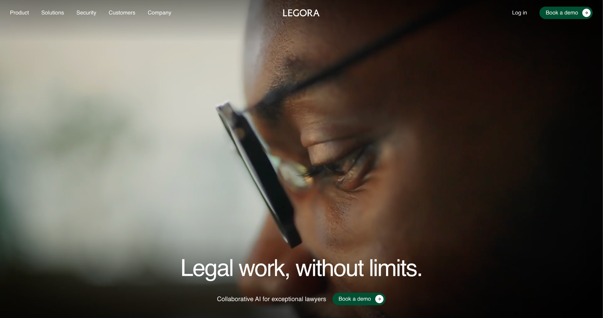
Why it works: Legora is the challenger to Harvey in the same category, and it wins attention by making one idea enormous. The hero is a single magnified interface element, an "Approve plan" button with a cursor about to click it, under the headline "Legal work, without limits." That one frame tells a liability-conscious buyer the lawyer stays in control of the AI, before any copy makes the claim. Security sits as one of only five top-level nav items, and nine separate solutions pages split the argument by practice area and firm type. What it does best is put its trust posture in the picture rather than the paragraph.
Steal this: If your product needs a human in the loop, show the moment of human approval in the hero.
Company Information
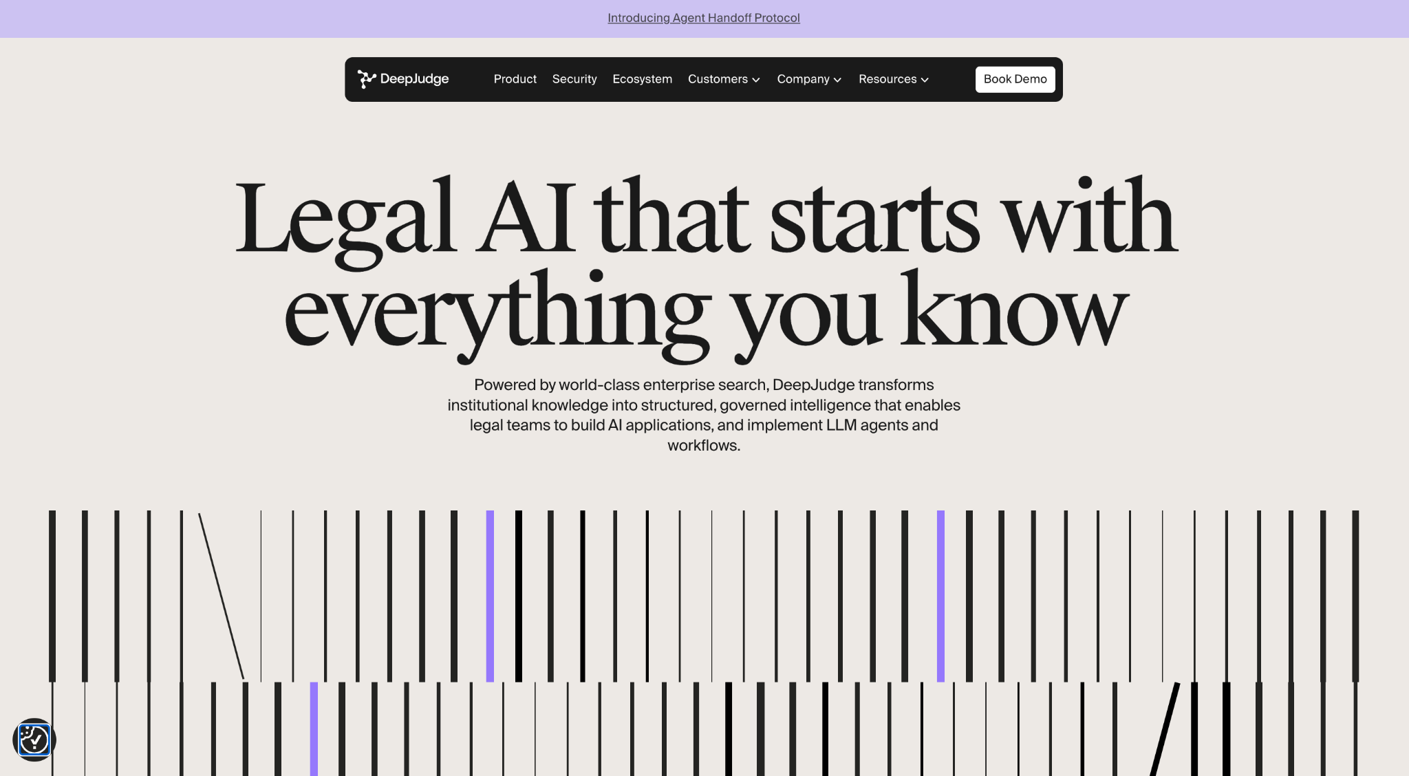
Why it works: DeepJudge is the smallest company in this group by a wide margin, and its site refuses to compete on scale. The hero is a working search box containing an actual lawyer's question, "What past cases are most similar to this one?", which demonstrates the product in one glance rather than describing it. The headline names the buyer immediately: "Legal AI that starts with everything you know." Security is one of five top-level nav items, and fifteen firm logos plus five hard metrics sit below the fold. What it does best is prove that a narrow, specific claim beats a broad one when you're the underdog.
Steal this: Put a real customer question in your search or input field instead of placeholder text.
Company Information
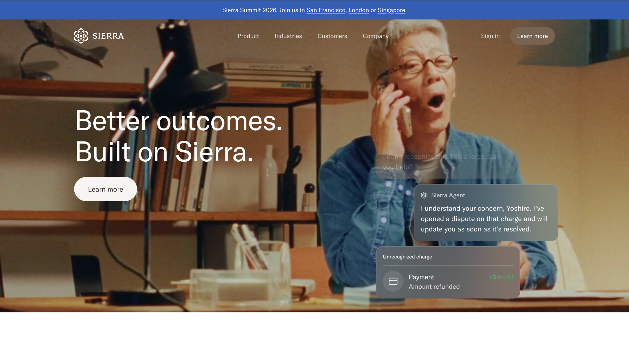
Why it works: "Agent" is an abstract word, and Sierra's hero refuses to leave it abstract. Behind the headline "Better outcomes. Built on Sierra." a customer asks to see her doctor that morning, the agent offers openings, and an appointment gets booked, all in one frame. It shows the end user rather than the buyer, which is unusual and smart: a CX director is buying an experience for someone else, so the site puts that someone else on screen. Behind the marketing, the trust center lists eight certifications and Sierra publishes its subprocessor list, naming Baseten, Fireworks AI, Together AI and Modal. What it does best is turn an abstract category into one concrete, completed task.
Steal this: Show your product finishing a job, not offering to start one. The confirmation state is the persuasive moment.
Company Information
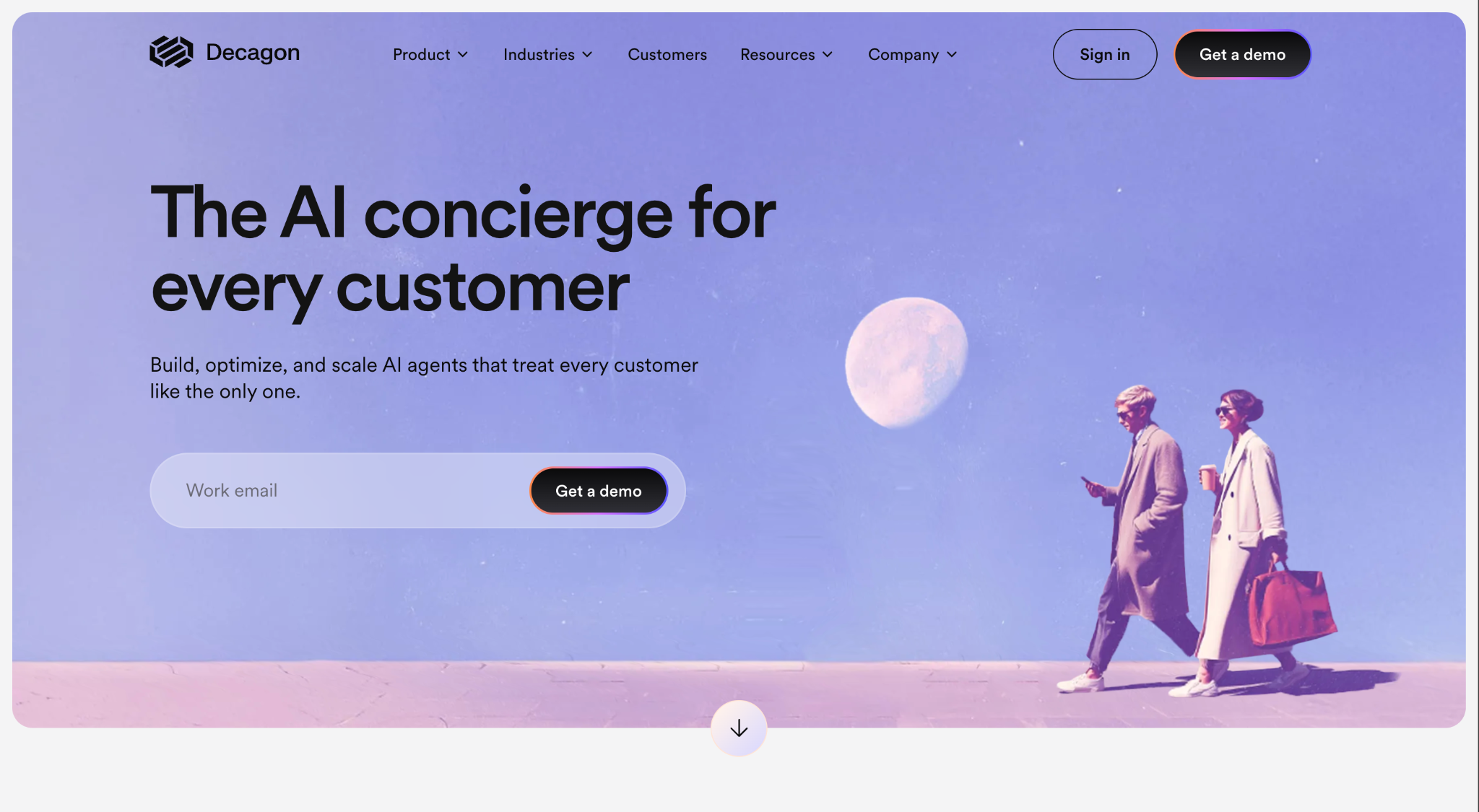
Why it works: Decagon sells to a buyer who has already been burned by a chatbot, so the objection isn't whether AI can answer questions but whether this one will embarrass them. Two choices answer that. The headline picks a word that carries a service standard rather than a technology: "The AI concierge for every customer." And the hero replaces the usual demo button with an email field, so the ask shrinks from booking a call to typing an address. Behind the marketing, published results do the arguing, an 80% deflection rate, 65% lower support costs, and $800,000 saved for every $250,000 spent alongside SOC 2 Type II, ISO 27001 and HIPAA with a BAA. What it does best is lower the cost of the first step without lowering the price of the product.
Steal this: Put an email field in the hero instead of a demo button. Same outcome, a fraction of the commitment.
Company Information
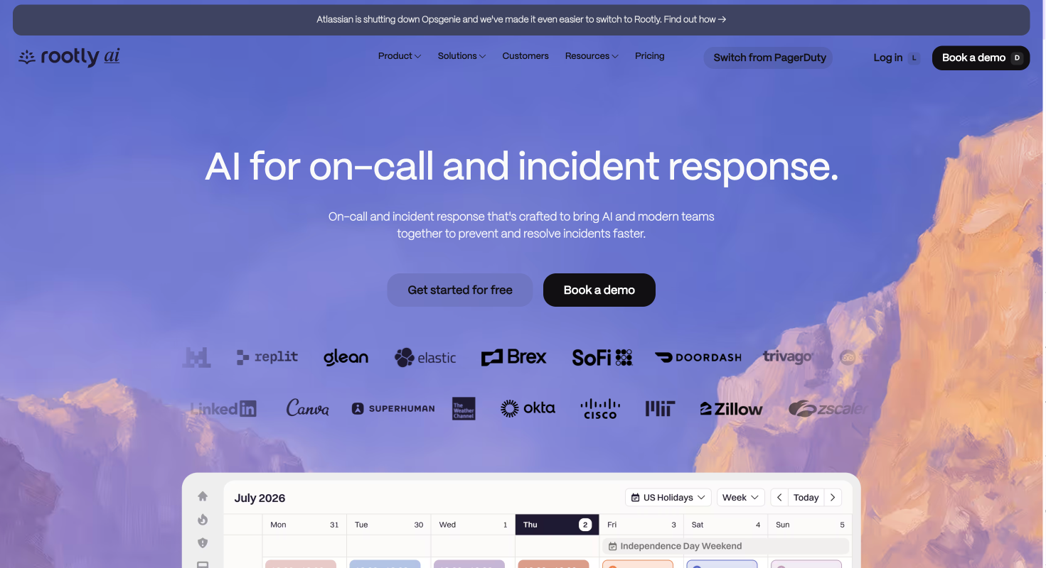
Why it works: Rootly sells to SREs, whose job is distrusting anything that claims to fix itself, and it earns that trust by giving everything away up front. Nineteen customer logos sit directly under the hero, including NVIDIA, Figma, Dropbox, LinkedIn, Stack Overflow and Replit. The product itself appears immediately below as a working on-call schedule. Pricing is a top-level nav item at a published $20 per user per month. But the sharpest move is a persistent "Switch from PagerDuty" button in the primary navigation, plus a banner announcing Atlassian's Opsgenie shutdown with a migration path. What it does best is turn a competitor's weakness into permanent navigation.
Steal this: If buyers arrive already using a competitor, give the switch its own nav item instead of burying it in a comparison page.
Company Information
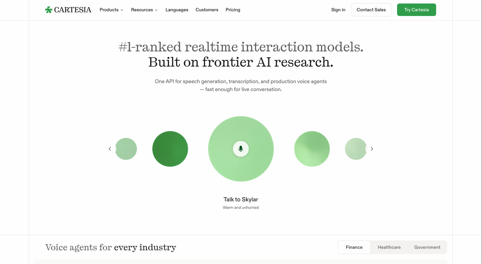
Why it works: Cartesia sells latency, which is impossible to describe and trivial to demonstrate. So the hero is a microphone button: pick a voice, press it, talk to the model. No signup, no form, no video. The headline does the qualifying work a developer needs "#1-ranked realtime interaction models. Built on frontier AI research." and the subhead states the scope in one line, one API for speech, transcription and agents. Pricing is a top-level nav item with five published tiers from free to $299, and a usage calculator sits on it. What it does best is let a technical buyer verify the single hardest claim in the product in about four seconds.
Steal this: If your differentiator is speed or quality, make the hero a button that proves it. A developer who can test your claim doesn't need to be sold on it.
Company Information
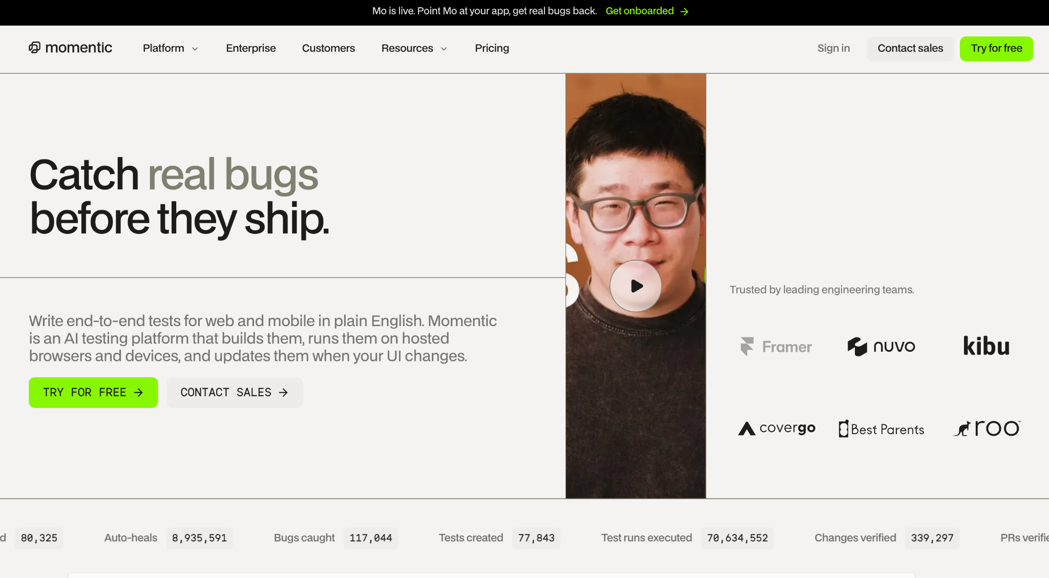
Why it works: Momentic is the smallest company on this list at roughly 54 people, competing against BrowserStack and Playwright, and it makes size irrelevant by putting verifiable numbers on the page. Six live counters run across the bottom of the hero, 117,015 bugs caught, 8.9 million auto-heals, 70.6 million test runs executed which is proof no competitor can copy without matching the usage. The headline promises an outcome in five words, "Catch real bugs before they ship," and the subhead explains the mechanism in one sentence with no jargon. Logos from Notion, Runway, Webflow and Podium sit in the first screen, and a founder video runs beside them. What it does best is replace the credibility a big company buys with numbers only a working product can produce.
Steal this: Put live product counters in the hero. A number that moves proves the thing is real in a way a logo bar cannot.
Company Information
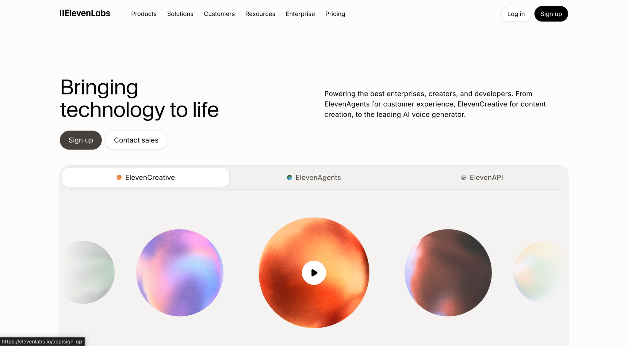
Why it works: ElevenLabs has the widest buyer range on this list, a hobbyist paying six dollars a month and a bank's procurement team land on the same page and it splits them inside the hero rather than further down. Three tabs sit directly under the fold line: ElevenCreative, ElevenAgents and ElevenAPI, one per buyer. Below them is a playable voice sample, so you hear the product before reading a word about it. "Sign up" and "Contact sales" sit side by side, and Pricing and Enterprise both get top-level nav slots. What it does best is let three incompatible buyers self-select in the first screen without any of them reading the wrong pitch.
Steal this: If you serve more than one buyer, put the split in the hero as tabs. Making people scroll to find their version is how you lose the other two.
Company Information
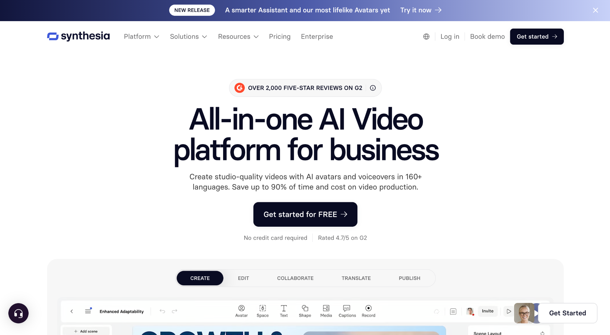
Why it works: Synthesia sells AI avatars of human beings, which is the most reputationally loaded product on this list, and roughly 70% of its revenue comes from enterprises whose legal teams will ask hard questions. The site handles that by stacking third-party proof at the top: a G2 badge for over 2,000 five-star reviews sits above the headline, and a 4.7 rating plus "no credit card required" sits under the CTA. The headline claims the category outright "All-in-one AI Video platform for business" and the subhead quantifies the outcome at 90% of time and cost saved. Below, a five-tab demo walks through create, edit, collaborate, translate and publish. What it does best is borrow credibility it didn't write itself.
Steal this: Put a third-party review badge above your headline. A rating you can't edit outranks a testimonial you chose.
Company Information
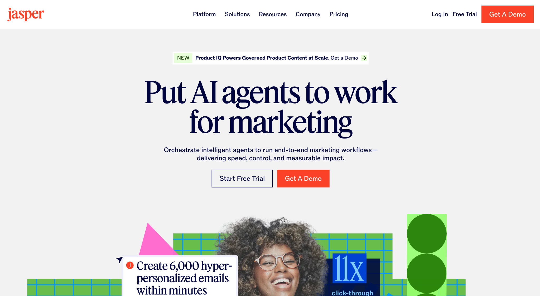
Why it works: Jasper is the cautionary tale of the AI era, ChatGPT made its original product free, and the site you see now is the rebuild. It works because it moved the claim somewhere a foundation model can't follow. The headline no longer offers to write copy; it offers to run workflows: "Put AI agents to work for marketing." The subhead names control and measurable impact, which are governance words, not creative ones. Underneath sits the deepest buyer segmentation in this list, six marketing roles and six industries, each with a page, plus a Trust Foundation hub covering security, governance, ethics and architecture. What it does best is prove a site can survive its category being commoditised by changing what it sells, not how loudly it says it.
Steal this: When a free tool copies your feature, stop selling the feature. Sell the governance, the workflow and the audit trail around it.
Company Information
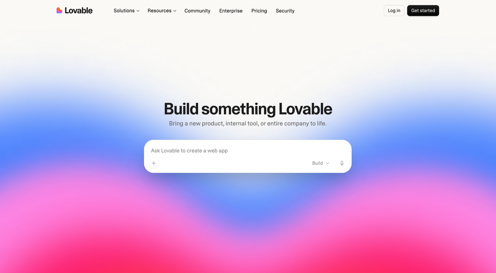
Why it works: Lovable sells something nobody believes until they watch it happen, so the homepage doesn't describe the product, it is the product. A working prompt box sits under a five-word headline, with a mic button, an attachment button and a Build mode selector already live. There is no screenshot, no video, no logo bar and almost no copy. Security gets its own top-level nav slot beside Pricing and Enterprise, which matters for a tool that lets non-engineers ship production software. What it does best is delete every step between arriving and using it.
Steal this: If your product runs on a prompt, put the real input box in the hero. A screenshot of your product is a worse demo than your product.
Twelve sites, five buyer groups, and almost no overlap in how they look. But strip away the visual language and the same five decisions show up again and again, and every one of them is a decision about the visitor rather than the product.
Not one of the twelve headlines contains the phrase. The strongest name a result: Momentic promises to "catch real bugs before they ship" in five words, and Legora claims "Legal work, without limits." Harvey goes further and names an identity rather than a task, "Build a Frontier Legal Organization." The weakest headline in the set proves the point in reverse: ElevenLabs opens with "Bringing technology to life," a line that would fit any company in this article. Its subhead recovers by naming enterprises, creators and developers in one sentence.
How to apply: Write your headline, then ask whether a competitor could paste it onto their homepage unchanged. If they could, it isn't a headline yet.
The best AI landing pages don't describe the product above the fold, they run it. Lovable puts a working prompt box in the hero with a live mode selector and mic, so the homepage and the application are the same surface. Cartesia gives you a microphone button and a voice to talk to, which verifies a latency claim in about four seconds. Sierra layers a real agent conversation over a human face, booking a doctor's appointment to completion. DeepJudge fills its search box with an actual lawyer's question rather than placeholder text.
How to apply: Replace the hero screenshot with the smallest interactive piece of your product you can safely expose. Show it finishing a job, not offering to start one.
Harvey puts six compliance badges on the homepage itself, with a security page in the main navigation and a public trust center behind it. Sierra goes furthest by publishing its subprocessor list, naming the infrastructure companies that touch customer data. Synthesia maintains separate security and AI governance pages alongside ISO 27001, ISO 42001 and SOC 2 Type II.
The surprise is who else does it. Lovable gives Security a top-level nav slot while selling to individuals, because a tool that lets non-engineers deploy live apps makes security a product question rather than a compliance one. The same logic shows up in regulated categories outside AI, which we've written about as a trust-first website framework.
How to apply: Build the security page before a buyer asks for it, and link it from the main navigation, not the footer.
ElevenLabs splits three incompatible buyers inside the hero itself, with tabs for creators, agents and the API, so nobody reads the wrong pitch. Jasper runs the deepest segmentation in the set, six marketing roles and six industries with a page each. Legora splits nine ways by practice area and firm type, so a banking lawyer and a litigator meet different arguments.
How to apply: Count your distinct buyers, then count your distinct paths. If the second number is smaller, you are asking someone to translate your pitch themselves.
Momentic runs six live counters in the hero, including 117,015 bugs caught and 70.6 million test runs, which a competitor cannot claim without matching the usage. Synthesia places a G2 badge for over 2,000 five-star reviews above its headline, borrowing credibility it didn't write. Rootly shows nineteen customer logos above the fold at roughly 75 employees, and Harvey shows forty.
Worth saying plainly: five of the twelve show no proof at all in the first screen. This is a genuine disagreement, not a rule. The pattern is that when proof appears early, it is specific and externally verifiable rather than a testimonial the company selected.
How to apply: Rank your proof by how hard it is to fake. A live counter beats a review badge, a review badge beats a logo, and a logo beats a quote you chose yourself.
Every mistake below is the inverse of something the twelve sites do well. If your homepage does three or more of these, the problem is positioning rather than design.
Five AI company website best practices come out of the twelve sites above. Lead with the outcome rather than the technology. Put the real product in the first screen. Link a security page from the main navigation, not the footer. Give every distinct buyer its own path. And use proof a competitor couldn't claim without earning it first.
Everything below is the implementation.
In page order. Each item names a site from this article that does it well.
The best AI landing pages follow the same sequence with fewer steps, because a single-purpose page can cut items 3, 7 and 9 entirely. If you're rebuilding rather than patching, this is the structure we start from on website design projects.
Beyond the homepage, eight pages carry the weight. Product or how it works, explaining the mechanism once, properly. Use cases, one page per buyer. Pricing, even if the enterprise tier is custom. Security or trust, with certifications reachable without a sales call. Customers, with named results rather than logos alone. About, because founder credibility is a real trust signal in AI. Blog or docs, whichever your buyer actually reads. And careers, which enterprise buyers check to gauge whether you'll still exist in two years.
The right-hand column isn't a list of old websites. Most of it appears on sites launched this year, because these are defaults rather than legacy decisions.
Four things matter more than the rest.
Choose Framer for a small, animation-heavy launch site that one designer maintains. Choose Webflow once the site becomes a growth channel that needs CMS depth, technical SEO, localisation and edits from marketers without developer time. Choose custom code when the marketing site and the product share a codebase and a design system.
We could only verify the platform behind five of the twelve sites, and those five gave five different answers: DeepJudge and Jasper on Webflow, Legora on Framer, Cartesia on Astro, Harvey on Next.js with Sanity behind it. That spread is the honest finding. There is no single stack the best AI startups converge on.
What the five do show is that platform tracks with what the site is being asked to do, not with how much the company has raised.
Be honest about where Framer wins. Legora is a $5.5 billion company running on it, so "Framer doesn't scale" is not a claim the evidence supports. For a site that is mostly one beautifully executed page, Framer is the faster, cleaner choice, and we say so in Webflow vs Framer.
Where Webflow wins is the pattern this article keeps returning to. Four of the five patterns above require pages: one per buyer role, one per industry, one per use case, plus a blog, a security page and case studies. Jasper runs twelve buyer pages, a blog, a prompt library and two diagnostic tools on Webflow at roughly a thousand people. DeepJudge runs Webflow at eighty people with Freshfields as a customer. The question isn't whether Webflow scales — it's whether your content model does, which is a design decision made early and expensive to reverse. We've written about CMS models that don't collapse as you grow.
Custom code is the right answer less often than engineers think. Harvey runs Next.js with Sanity, which makes sense at its scale. Below that, the marketing site becomes a queue item behind product work, and the cost shows up as pages that never ship. We've compared the real numbers in Webflow vs a custom-coded site.
Twelve sites, five buyer groups, and no shared visual language at all. Harvey stacks forty logos above the fold; Lovable shows none. Sierra puts a human face in the hero; Cartesia puts a microphone button. Rootly publishes $20 a month; Decagon publishes nothing.
What they share isn't a style. It's that each one made a decision about who was arriving and built everything downstream from that answer. The headline, the hero, the CTA, the pricing, the nav, all of it follows from the buyer, not from what looked good in the category.
That's why the copy-the-leader instinct fails so reliably in AI. Copying Harvey's compliance-heavy homepage onto a developer tool produces a site that argues with itself. The transferable thing isn't the execution; it's the order of operations. Decide who you're for, then let every element answer to that.
If your current site can't survive that question, the problem usually isn't design. It's that the answer was never settled.
Whether you're launching your first site or rebuilding one that stopped working, the hard part is the same: deciding who it's for before you decide what it looks like.
Book a call with That Webflow Agency to work out which of the five patterns your site needs and what building it in Webflow would involve.
Harvey, Legora, DeepJudge, Sierra, Decagon, Rootly, Cartesia, Momentic, ElevenLabs, Synthesia, Jasper and Lovable. Each was reviewed in September 2026 against the same five criteria: headline clarity, product visibility, security disclosure, buyer routing and proof. Full breakdowns and a comparison table are above.
A good AI company website does three things fast. It explains what the AI actually does in plain words, proves the product is safe and real, and gives each type of buyer a clear next step. Sites that miss any of the three lose the visitor before the design matters.
An outcome-led headline, a subhead naming who it's for, the real product or a live input, and one primary CTA. Avoid abstract AI imagery. The strongest examples here run the product itself in the hero rather than a screenshot of it.
Match your audience, not the trend. Developer tools often use dark interfaces because engineers work in dark IDEs all day. Enterprise legal and finance buyers generally expect light, document-like layouts. Of the twelve sites reviewed here, most use light backgrounds. Dark mode is a fit question, not a quality signal.
Four things, in order of weight. Certifications reachable without a sales call, such as SOC 2 Type II and ISO 27001. A security page in the main navigation. Named customers with specific results. And an explicit statement on whether you train on customer data.
Framer for a small animation-led launch site, Webflow once the site becomes a growth channel needing many buyer pages and marketer-led edits, custom code when the marketing site shares a codebase with the product. Among the sites we could verify, all three approaches appear.
Real product in the hero, a public security page in the main navigation, a free tier or trial alongside the demo, use-case pages by role, a recent changelog or research feed, and fast mobile performance. Outdated sites show stock AI imagery and demo-only CTAs.
A freelancer suits a single launch page. An agency suits a structured growth site with a content model built to scale. In-house makes sense once the site changes weekly. We've compared the trade-offs in agency vs freelancer vs in-house.