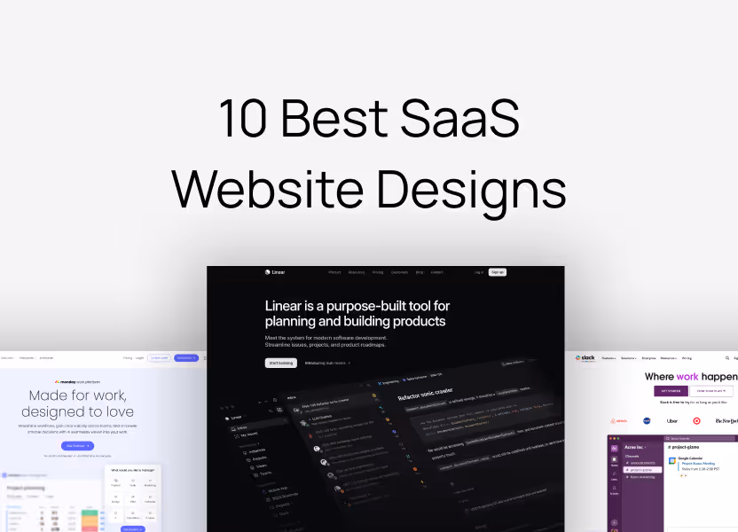
10 Best SaaS Website Designs in 2025 (And Why They Work)
We analyzed 10 of the best SaaS websites that get design and conversions right. Learn what they do well, why it works, and how to apply it to your own site.
Sharon Gwal
Key Takeaways
Clarity beats creativity - The best SaaS websites explain what the product does, who it's for, and why it matters in under 5 seconds.
Simple navigation converts better - Minimal design with clear CTAs reduces cognitive load and guides users toward action without confusion.
Trust signals are essential - Customer logos, testimonials, and case studies build credibility and increase conversions significantly.
Speed directly impacts conversions - Fast-loading sites with mobile-first design perform better, as every one-second delay reduces conversions by 7%.
Strategic motion enhances UX - Animations should guide users and highlight features, not distract or slow down the experience.
One clear CTA works best - Placing a single, prominent call-to-action above the fold with strong contrast drives more conversions than multiple competing buttons.
A beautiful SaaS website doesn’t guarantee success.
In fact, some of the highest-converting SaaS websites aren’t winning design awards they’re winning customers.
Why?
Because great web design isn’t just about aesthetics it’s about guiding users toward action. A website that’s visually stunning but fails to convert visitors into sign-ups is just a digital art piece, not a business asset.
In this guide, we’ll break down 10 SaaS websites that have nailed both UX and conversions whether they look traditionally “beautiful” or not.
By the end, you’ll have clear, actionable insights to apply to your own SaaS website so you can focus on what truly matters: turning visitors into customers.
Ready? Let’s dive in.
What Makes a Great SaaS Website?
A great SaaS website isn’t just about looking modern or using trendy UI elements it’s about getting potential customers to take action.
The best SaaS websites follow a clear framework that ensures visitors understand, trust, and convert.
Here’s what they all have in common:
1. Clear & Immediate Value Proposition
Can users understand what your product does in under five seconds?
Your homepage should answer three questions instantly:
What is this? (Product clarity)
Who is it for? (Target audience)
Why should I care? (Unique value)
2. Seamless User Experience (No Friction, No Confusion)
A confused user never converts.
Simple, intuitive navigation – Users should find what they need without thinking.
Minimalist, uncluttered design – Too many choices overwhelm visitors.
Fewer form fields = higher conversions – Only ask for essential information.
3. High-Impact Calls to Action (CTAs in the Right Places)
Your CTA should be obvious users shouldn’t have to hunt for it.
Above-the-fold CTA: The first thing users see should include a clear action step.
Sticky CTA in the navigation bar: Always accessible as they scroll.
CTA contrast: The CTA button should stand out from the background.
4. Trust Signals & Social Proof (Credibility Converts)
People trust what others trust.
Logos of well-known customers – Shows your product is credible.
Testimonials & case studies – Reinforce trust with real user success stories.
Security & compliance badges – Especially critical for B2B SaaS.
Trust-building through logos of well-known customers and testimonials.
Key Takeaway:
If you’re in a competitive SaaS space, invest in clarity and credibility—design with authority in mind.
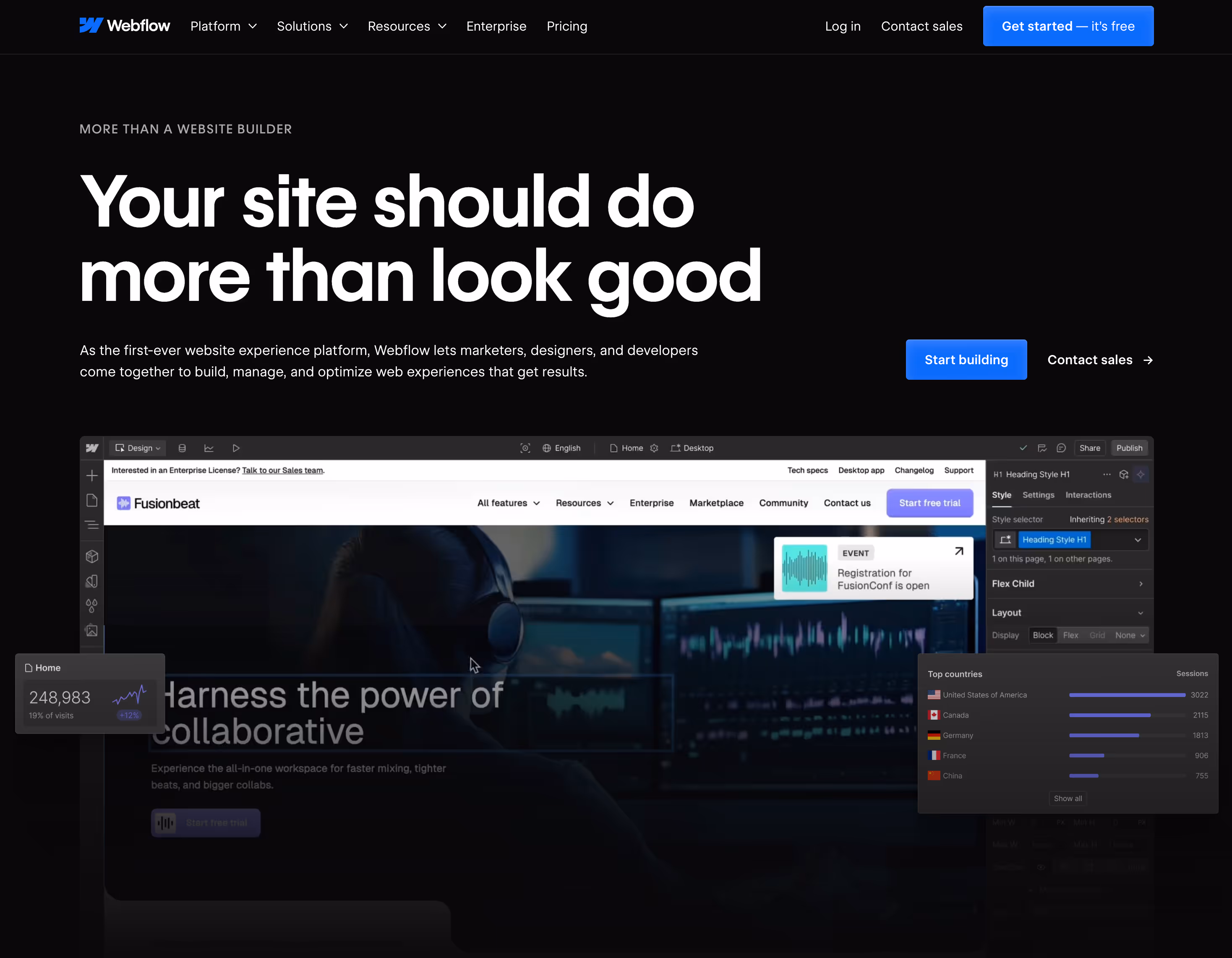
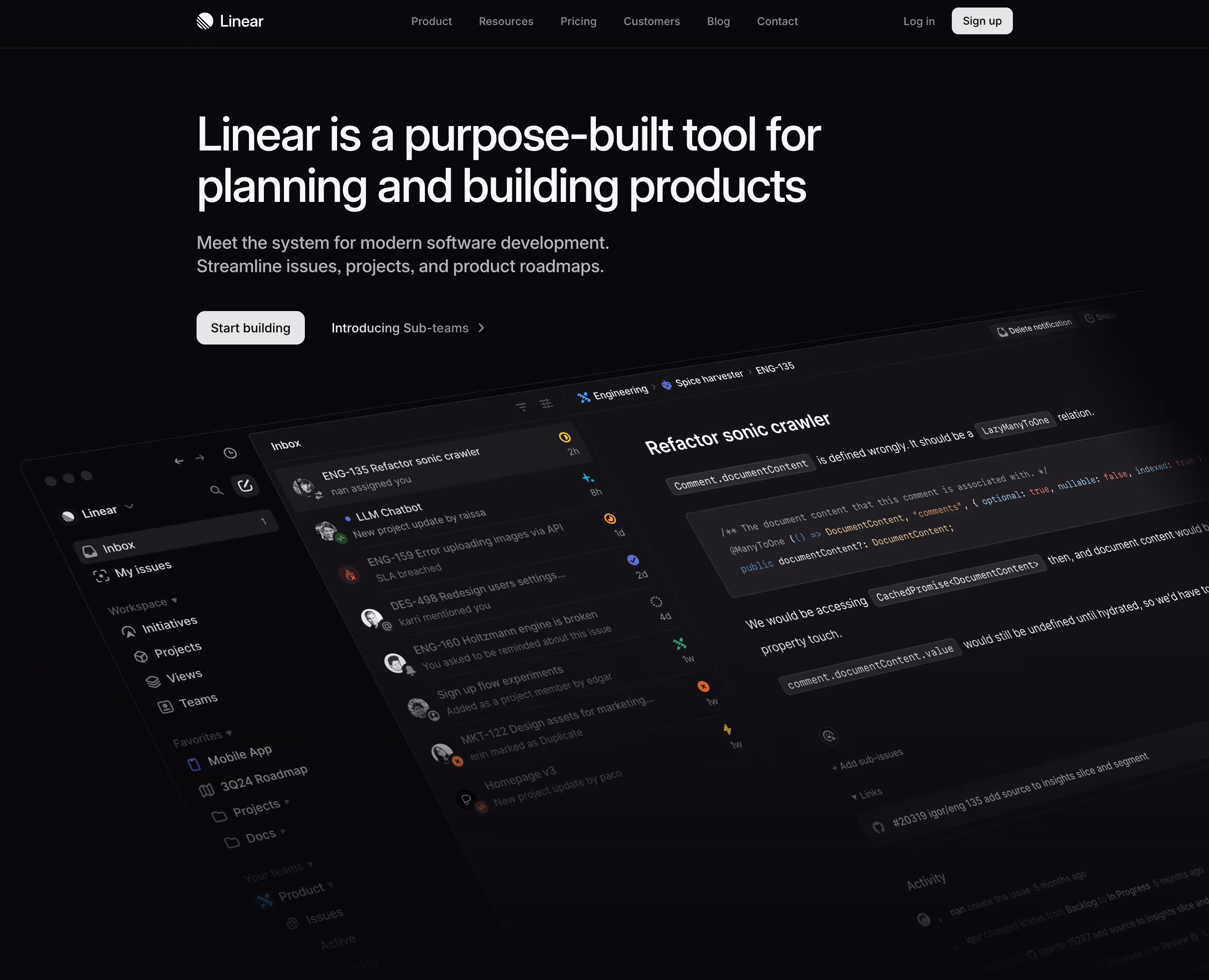
4. Linear – Design Precision for a Technical Audience
linear.com
What They Do Well:
Beautifully balanced interface with precise spacing, typography, and alignment.
Crisp copywriting that speaks directly to product-minded developers and teams.
Strong product positioning—Linear doesn’t try to appeal to everyone, it speaks clearly to its niche.
Live previews and subtle interactivity that feel intentional, not excessive.
Why It Works:Linear’s website is a masterclass in restraint and intentionality. Everything from its design to the tone of voice is crafted for technical, discerning users. It doesn’t shout it calmly reassures. The layout, animations, and messaging reflect the exact values the product promises: speed, clarity, and control.It’s not flashy. It’s not trying too hard. And that’s exactly what makes it brilliant.
Key Takeaway:If your product is for a specific, high-context audience, lean into that. Build your website to feel like an extension of your product precise, thoughtful, and deeply aligned with user expectations.
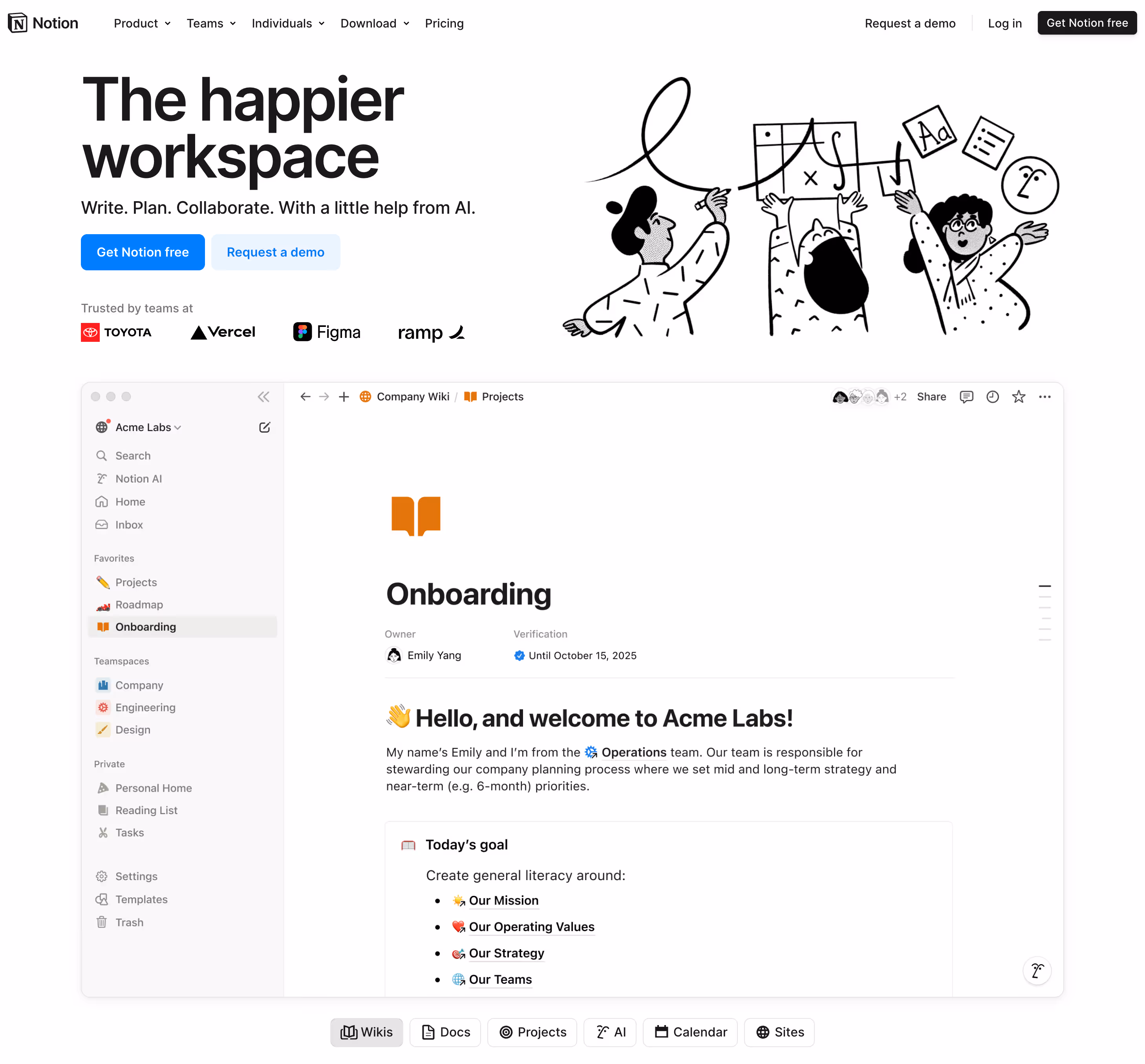
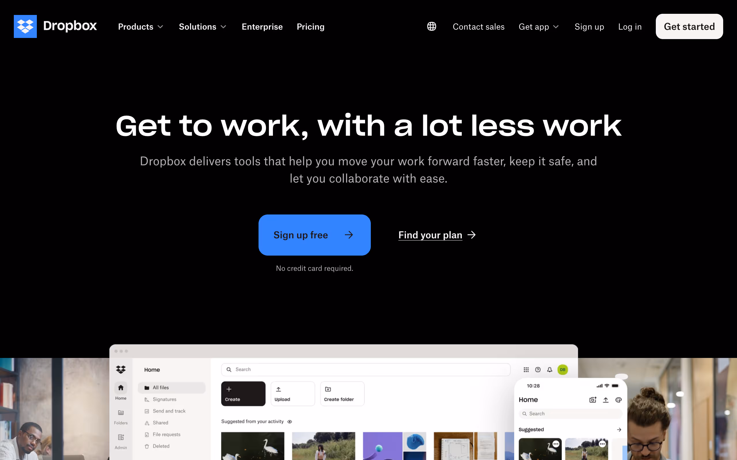
Crystal-clear messaging immediate understanding of what Dropbox does.
Strong visuals that reinforce the idea of collaboration and file security.
Key Takeaway:
A clean, distraction-free website that focuses on one key message creates less cognitive load and increases conversions.
Common SaaS Website Redesign Mistakes (And How to Fix Them)
Redesigning a SaaS website isn’t just about making it look better it’s about making it work better.
Many companies invest time and money into a sleek new design, only to see their conversions drop because they overlooked key usability and conversion principles.
Here are some of the most common SaaS website redesign mistakes and how to fix them.
1. Focusing on Aesthetics Over Conversions
The Mistake:
Many redesigns focus on making the website “look modern” but ignore user behavior, conversion principles, and real data. The result? A site that might win design awards but fails to convert visitors into customers.
How to Fix It:
Start with data, not design – Use heatmaps, user recordings, and A/B testing before redesigning.
Prioritize clarity over creativity – Make sure users instantly understand what your product does.
Test every major change – A/B test headlines, CTAs, and layouts before making big decisions.
2. Making the Homepage Too Overwhelming
The Mistake:
SaaS companies often cram too much information into their homepage long feature lists, complex product descriptions, and multiple CTAs all competing for attention.
How to Fix It:
Follow the 5-Second Rule – Within 5 seconds, users should know:
What your product does
Who it’s for
Why they should care
Stick to a single CTA above the fold – Too many CTAs cause confusion.
Use whitespace effectively – Avoid clutter. The simpler, the better.
3. Overcomplicating the Signup or Trial Process
The Mistake:
Many SaaS websites add unnecessary friction during signup long forms, mandatory credit cards, or forcing users to go through multiple steps before trying the product.
How to Fix It:
Remove unnecessary form fields – Only ask for what’s truly needed.
Offer a no-credit-card trial if possible – Reduce commitment anxiety.
Allow social logins – Google, Slack, or Apple logins make it easy for users to get started.
4. Weak Pricing Page That Fails to Guide Users
The Mistake:
A confusing or poorly structured pricing page leads to decision fatigue. Many SaaS companies:
Present too many plans at once.
Hide key details under dropdowns.
Fail to highlight the best-value plan.
How to Fix It:
Limit choices – If you have multiple pricing tiers, visually emphasize the recommended plan.
Use a “Most Popular” tag – This reduces friction and nudges users toward the best option.
Make feature comparisons easy – Use side-by-side tables instead of hidden descriptions.
5. Slowing Down the Site With Heavy Animations & Large Images
The Mistake:
A redesign often includes fancy animations, high-resolution images, and autoplay videos but if they slow the site down, visitors leave before even seeing your product.
How to Fix It:
Compress images & use next-gen formats (WebP, AVIF) – Faster load times without losing quality.
Lazy load images & videos – Load content only when needed, not all at once.
Reduce excessive animations – Use motion sparingly, only when it enhances UX.
6. Ignoring Mobile & Responsiveness
The Mistake:
Many SaaS websites look great on desktop but feel broken or clunky on mobile hard-to-click buttons, overlapping text, or missing CTA visibility.
How to Fix It:
Mobile-first design – Design for mobile first, then scale up to desktop.
Test with real users – Simulate real-world scrolling, tapping, and form fills.
Make CTAs easy to tap – No tiny buttons ensure thumb-friendly tap targets.
7. Removing Trust Signals & Social Proof
The Mistake:
Some redesigns remove customer logos, testimonials, or case studies in favor of a cleaner look but trust-building elements are critical for conversions.
How to Fix It:
Feature real customer testimonials – Use quotes with names, faces, and company details.
Showcase logos of well-known customers – Builds credibility instantly.
Include case studies – Real-world success stories increase buyer confidence.
8. Not Personalizing the User Experience
The Mistake:
Many SaaS websites treat every visitor the same, regardless of whether they are new, returning, or high-intent buyers.
How to Fix It:
Use dynamic CTAs – New users see “Start Free Trial,” while returning visitors see “Continue Your Trial.”
Segment homepage messaging – Offer different headlines for different industries or user needs.
Leverage live chat & AI chatbots – Guide users toward the right plan or next steps based on behavior.
Takeaways: What You Can Apply to Your SaaS Website Today
We’ve looked at what makes a great SaaS website, broken down real examples, and even walked through common redesign pitfalls. Now, here’s what you can take away and start applying today:
1. Clarity Beats Cleverness
Your homepage should explain what your product does, who it’s for, and why it matters—in 5 seconds or less. If you confuse users, you lose them.
2. Guide the User, Don’t Just Impress Them
Design isn’t about decoration it’s about direction. Make sure your layout, CTAs, and content guide users toward action, not just wow them visually.
3. Make Your CTA Impossible to Miss
Place it above the fold. Make it stand out. Use action-focused language. And don’t give users five buttons to choose from—just one is often enough.
4. Build Trust at Every Step
Logos, testimonials, case studies, security badges they’re not optional. Trust builds confidence, and confidence drives conversions.
5. Keep Speed & Mobile Experience a Priority
Fast sites convert better. Mobile-first design isn’t a trend it’s the default now. Your SaaS site needs to load quickly and work seamlessly across devices.
6. Focus on Real UX, Not Just UI
A good-looking site that’s hard to use won’t perform. A well-structured, intuitive experience that’s built for your audience? That’s what moves the needle.
Want a High-Converting SaaS Website?
If you're serious about turning your website into a growth engine, we can help.
At That Webflow Agency, we help B2B SaaS businesses improve conversions with Webflow-powered websites. Whether you're starting fresh or rethinking your current site we’re here to help you do it right.
Look for agencies with proven SaaS experience and case studies showing conversion improvements. Check if they understand your target audience, can explain design decisions clearly, offer strategy beyond just visuals, work with tools like Webflow or your preferred platform, and provide post-launch support. Ask for client references and review their process before committing.
Should SaaS websites prioritize design or functionality?
Both matter, but functionality should guide design choices. Your website needs to look professional and trustworthy, but if beautiful design makes it harder to understand your product or slows load times, it hurts conversions. The best SaaS sites balance clean aesthetics with fast performance and clear messaging that drives action.
What are the key elements of a SaaS homepage?
A strong SaaS homepage includes a clear headline that explains what you do, a concise subheadline that adds context, visible CTAs above the fold, social proof like customer logos or testimonials, feature highlights with benefits, pricing information or a path to it, and trust signals like security badges or certifications.
What makes a good SaaS website design?
A good SaaS website design clearly explains what the product does within seconds, uses social proof to build trust, has a simple navigation structure, includes strong CTAs that guide visitors to sign up or book a demo, and loads fast on all devices. The best designs focus on clarity over creativity and help visitors understand the value immediately.
Why is website design important for SaaS companies?
Website design is critical for SaaS companies because it's often the first interaction potential customers have with your product. A well-designed site reduces friction in the sales process, builds credibility, improves conversion rates, and helps visitors quickly understand if your solution fits their needs. Poor design can cost you signups even if your product is excellent.
What's the difference between B2B and B2C SaaS website design?
B2B SaaS sites typically need more detailed information, case studies, ROI calculators, and demo booking options since sales cycles are longer. B2C SaaS sites focus on quick signups, simpler messaging, pricing transparency, and emotional triggers. B2B designs serve multiple stakeholders while B2C targets individual decision-makers.

-1.png)
